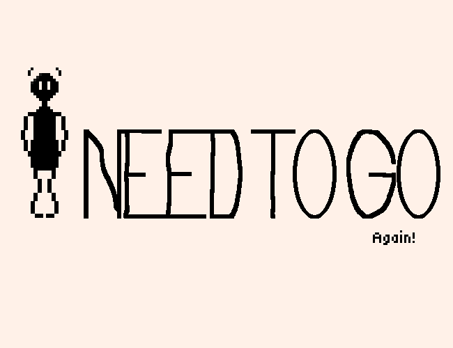
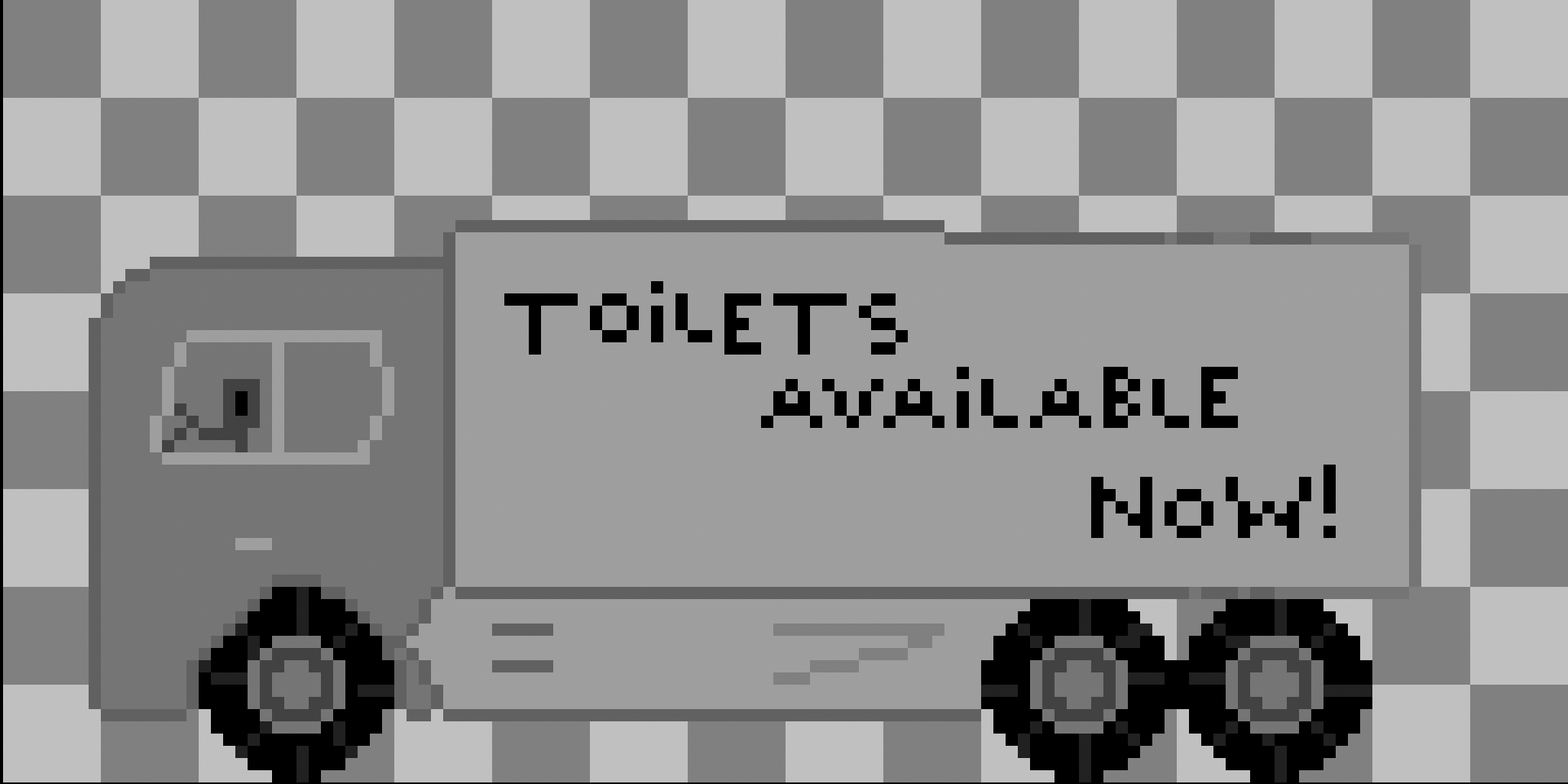
Improving "I need to go"

My experience with learning 2D art, and especially animation was tough. It was a demotivating process that turned out to be very rewarding with patience, sleep and some mercy for myself. In turn, I am now very eager to learn more.
I remade "I need to go" not due to lesser feedback, but due to my own dissatisfaction and gentle need to keep my games up to a certain standard, even if they are just learning experiences.
Follow along through my process of realizing this, and further improving the game.
Release
Originally releasing the game felt unsatisfying, it felt low in energy, and it felt demotivating. My feelings towards the game weren't happy, and I didn't feel like I scored yet another win in this challenge of learning game development. Instead I felt like I rushed the project to get it out, due to some invisible time constraints or due to a subconscious need to finish it and move on to learn more and more.
As you can imagine, this lead to me skipping out on details, undervaluing testing, not applying the skills, knowledge and basics I had learned thus far. Even the stuff I was learning on the go wasn't utilized to the full potential at that time.
So I decided to take a break from rushing towards the next game. Instead, I told myself to take a break, breathe and let my brain process all that I had learned, and slowly apply it to the game. Fix it, review it, release it again.
All of that to say that I am now happy with where the game is, and I was, and still am genuinely happy to release it, and to know how much I have learned from this more challenging experience.
Art
The art was decent for my first time, yet very lacking. Especially when it came to the color department.
I do not mean to bring myself down as it is only normal for my art to be or feel lacking. After all, I am but a beginner whose learning and experience has just begun. Yet when I originally released the game, I felt unsatisfied. Something within me just didn't feel good about releasing the game as it was. Not only that, but I received mostly negative feedback due to unresolved or undiscovered bugs, the art being too gray or too similar in color to other sprites.
The game actually didn't feel good to play for some, either. The general feeling of friends, family and you - was that it did not feel responsive, and sometimes unfair too.
Researching color theory
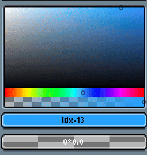
During my break, I spent more time researching and learning about color theory. I found this excellent video by YouTuber Watt and he explained so clearly what some of the basic concepts are, and how to apply them to pixel art. A frustrating, yet rewarding process was to finally be able to make my own color palette and not be unhappy with it only 5 minutes after trying to use it.
I say "trying" because making a color palette was one thing, but then knowing when, how and where to utilize the colors from this palette was a whole other story. In essence, It took me time to learn the basics, and I remade as good as all the art in the game to be more consistent and easier on the eye.
Applying color theory
My favorite part so far is knowing how to darken and brighten colors so they better fit together. I used to think that darkening colors is just pushing the hue to a darker tone and that's that.
However, it's not! Yet the better way is actual pretty simple. I kept myself to this rule: "Brighten colors by shifting the hue toward yellow, darken colors by shifting the hue toward blue. Adjust saturation and value accordingly."
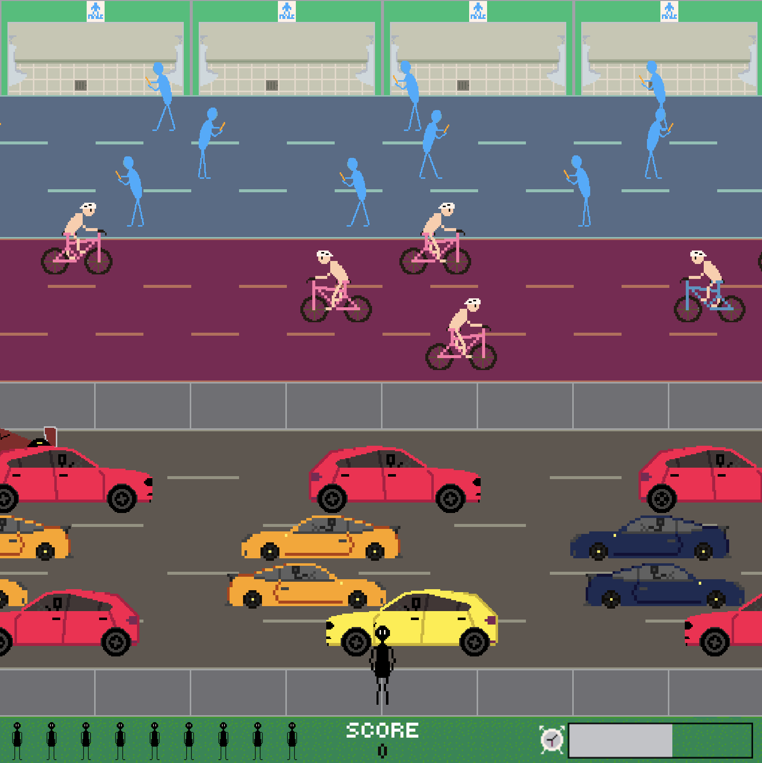
Level design
I began with recreating tile map for the level. Not necessarily in quality of details, but in colors. Throughout my research, I learned about complementary and analogous colors, as well as HSV (Hue, Saturation, Vibrance). With the basics of that in my head, I began to see how to use them a bit more, and tried my best on the new tile map. The level is now an actual background, as is expected from this game. The colors pop, they portray what they need to, without striking you or taking attention away from the obstacles.
Obstacles
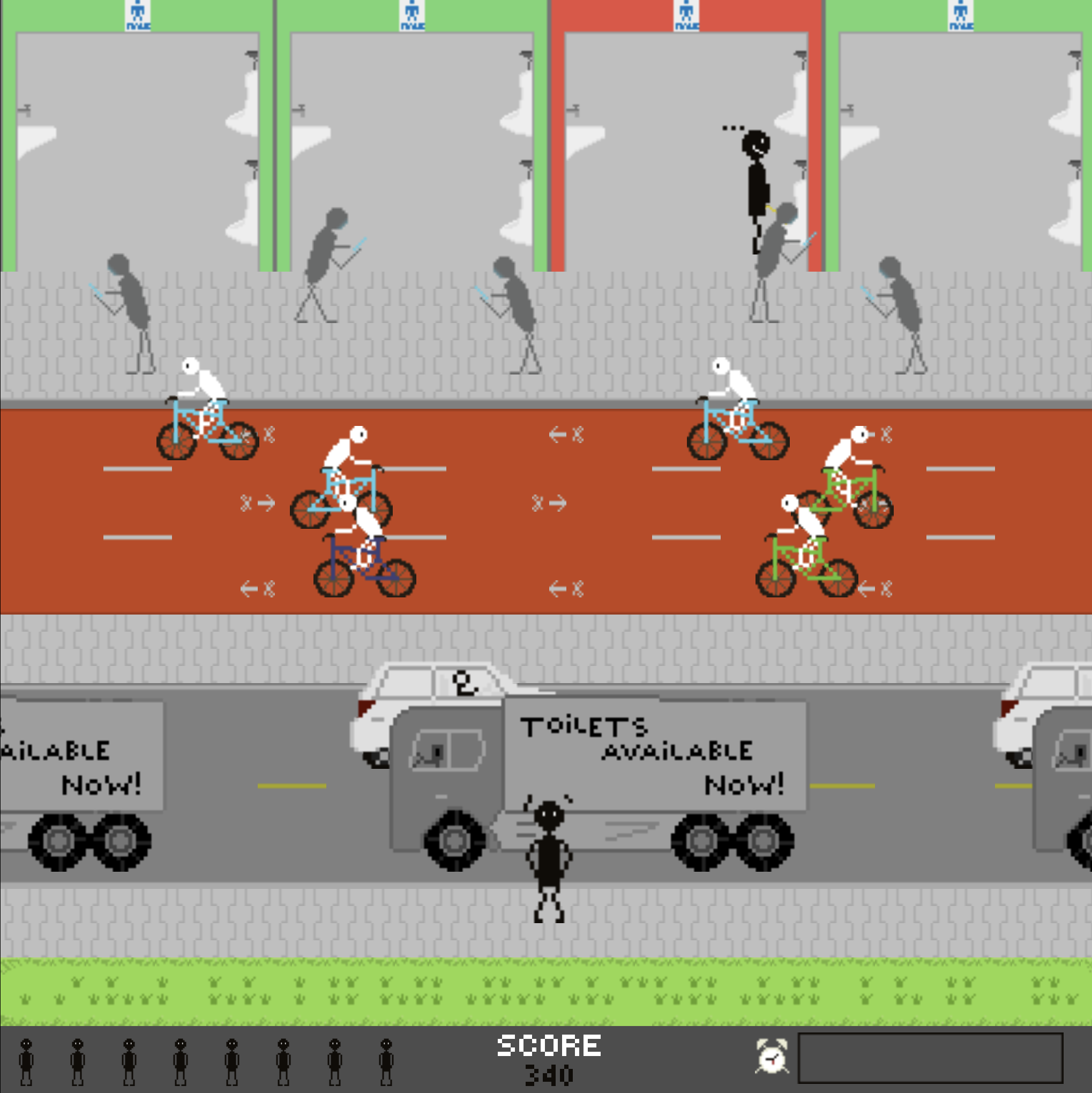
The obstacles have all received either a complete recreation, or some updates to better reflect what they are supposed to be. This can either be in coloring, minor details, or even size!
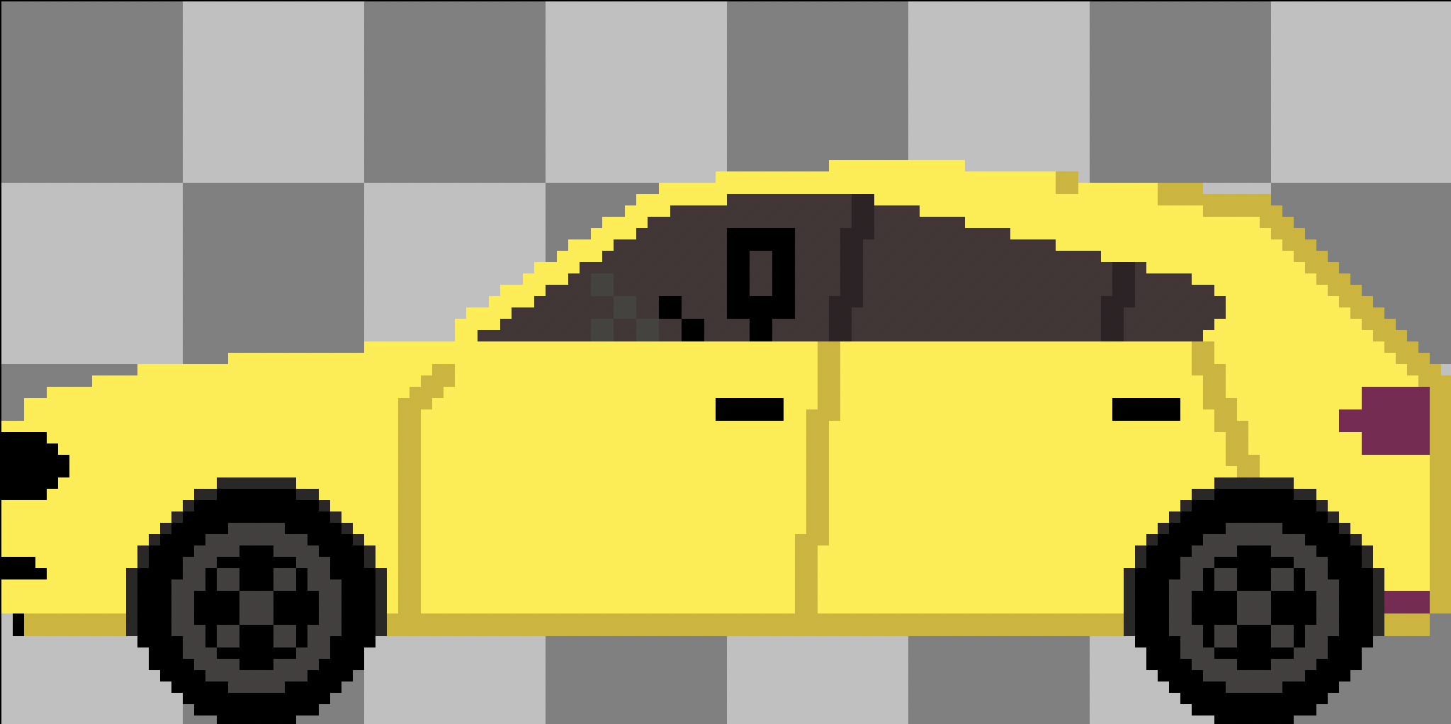
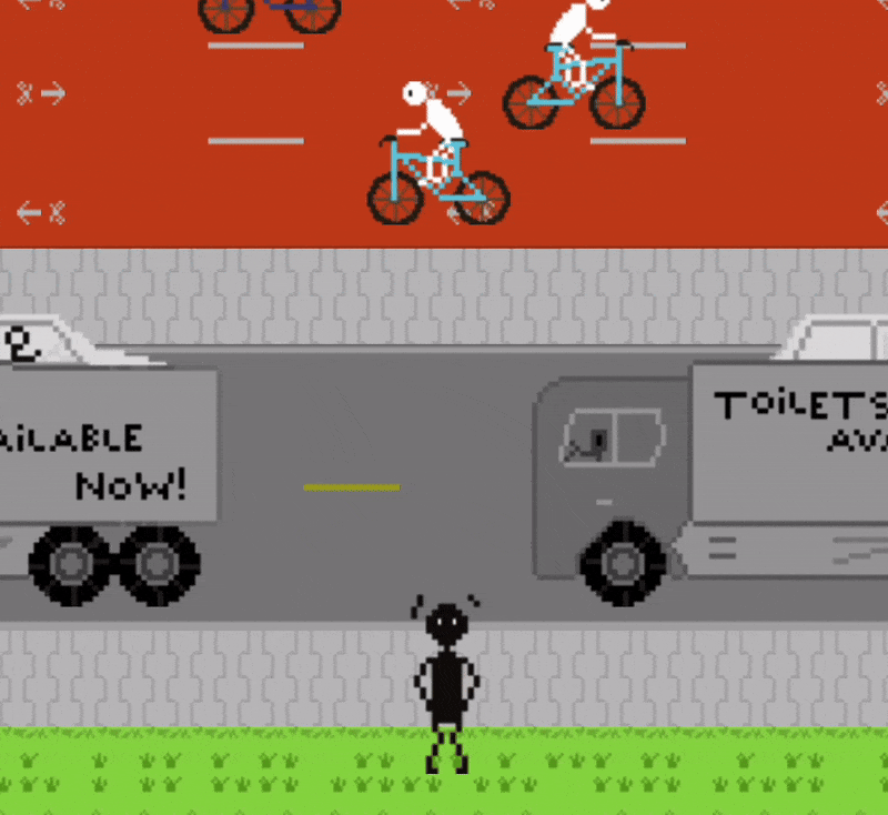
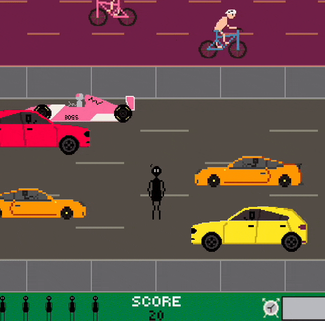
Here's the cars getting a complete recreation:
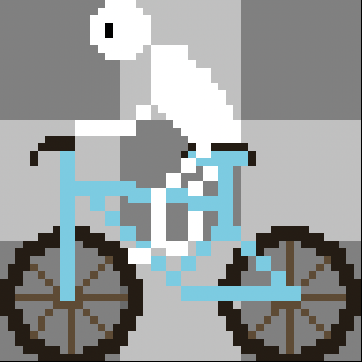
The biker is now a responsible biker:
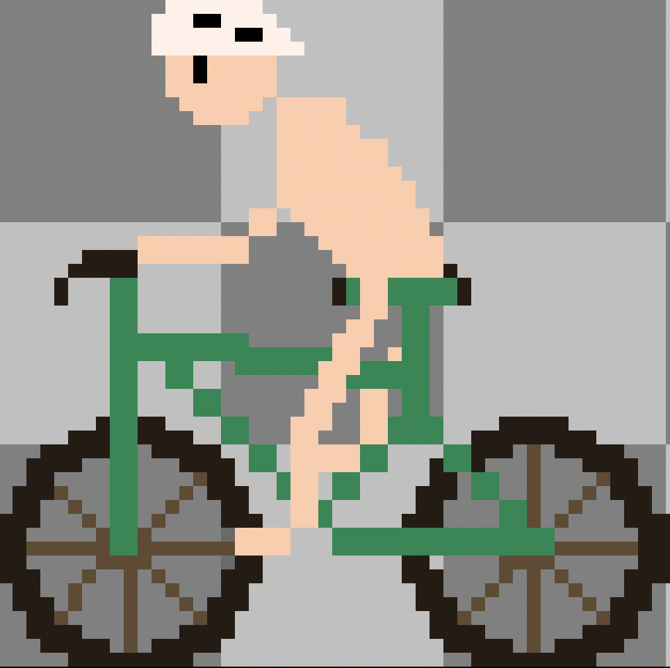
The pedestrian received a color change:
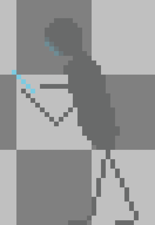
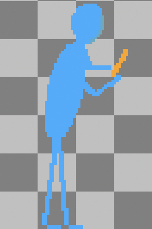
As you can hopefully see, the art is much more detailed. This improvement is the effect of letting my brain process what I had learned, and the practice I had put into it before that. Instead, I rushed through everything.
Gameplay
The gameplay has more or less stayed the same. Biggest change from the original version was that I made the level more consistent.
Unfair level design
I didn't know how to make it work at first, and instead of being patient and letting some critical thinking happen through sleep or processing, I rushed. This caused the following issue: Some lanes stretched more than how much distance per move the player made, causing them to have to move twice to get out of a lane.
This was very confusing to most players, and felt quite unfair too. The fix was to make the width of the lanes equal to the distance per move the player made.
Let's compare!
Original: notice how you need to make more than two moves to get through two lanes.
Improved: notice how you need to make only two moves to get through two lanes.
Obstacle spawning
A smaller yet crucial issue, I completely overestimated the average player's ability to understand how to play, and how unfair it is of me to make a level so or so difficult. A level that felt very easy to me, was a serious challenge for someone else.
- Too quick spawning of obstacles
- Not enough space between obstacles
On the other hand, more experienced players figured out the levels instantly and rushed through them. This was because the obstacles were spawning at the same frequency, in the same location. Quickly a pattern was to be found and so the level solved quickly.
I solved this by simplifying the spawning logic, and simply adjusting the speed of the obstacles, and their spawn position set off from different points of the x-axis.
Conclusion
Without a doubt, getting the hang of the very basics of color theory and applying it was the most difficult task for me to tackle in this challenge so far. Gameplay balancing is tricky too, and definitely something to keep in mind for the next game.
All this to say that I actually learned so much in hindsight, and this motivates me a lot to keep pushing through the difficulty, to not let frustration allow me to rush or give up. The aftermath is always full of progress.
If you have any feedback or stories of your own to share, feel free to reach out on social media!
Thanks for reading! ❤️
I want to read more!
It'd be my honor.
- I need to go released!: Play the game yourself!
- Development of "I need to go": The smooth, the tough, and the ugly.
- About me and Problem 18: Explanation of me and Problem 18!